Understanding Color Psychology in the Home
Have you ever walked into a room and immediately felt a sense of calm, energy, or even excitement, without quite knowing why? Chances are, color psychology was at play. Colors are more than just visual preferences; they impact our emotions, moods, and behavior. Understanding how different colors affect us can transform your interior design choices from mere aesthetics to creating spaces that truly nurture your well-being.
This guide will delve into the psychology of interior color schemes, revealing how features like furniture and barn doors can be strategically integrated into a plan to amplify your home’s tone.
Understanding the basics of color psychology
Before we explore specific colors, let's grasp a few fundamental concepts:
- Warm colors (reds, oranges, yellows). These are often associated with energy, passion, warmth, and comfort. However, they can also be overwhelming if overused, especially in red color psychology.
- Cool colors (blues, greens, purples). The broad blue color psychology evokes feelings of calm, serenity, peace, while green color psychology lends itself to spaciousness. Note, they can sometimes feel cold if not balanced.
- Neutrals (whites, grays, beiges, browns). These are versatile and grounding, providing a stable backdrop for other colors.
Planning whole house interior color schemes
Let's explore specific colors and how you can harness their psychological power, with a special focus on how your barn door can contribute to the overall effect.
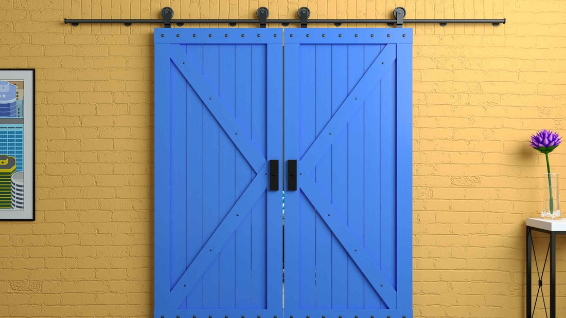
1. Blues & greens for a serene sanctuary
These tones can effectively contribute to creating a sense of calm, peace, serenity, stability, freshness, growth, harmony. Blues are often associated with the sky and sea, promoting relaxation. Greens connect us to nature, fostering balance and renewal. Consider these tones as base layers or major features in relaxing spaces like bedrooms, bathrooms, home offices, meditation spaces.
2. Yellows & oranges to craft an energetic & cheerful hub
Colors such as these contribute effectively to feelings of happiness, optimism, warmth, energy, creativity, enthusiasm, and stimulation. Yellow is often linked to sunshine, while orange combines the energy of red with the happiness of yellow. Use them as a means of brightening up kitchens, dining rooms, playrooms, creative studios, and entryways.
3. Reds & pinks can power places with passion & romance
Reds have to be used responsibly, but can invigorate spaces with passion, energy, excitement, intensity, warmth, and courage. Pink is more commonly associated with romance, sweetness, nurturing, tenderness, and a sense of warming calm. Red should be applied to dining rooms to stimulate conversation and appetite, while soft pink accents can enhance relaxation in living rooms, bedrooms.
4. Neutrals are the versatile canvas for interior color palettes
Never underestimate the power of neutral color palettes when setting up your home, whether as pure base layers or in larger pieces of decor.
- White captures purity, cleanliness, spaciousness, simplicity, and freshness.
- Grey is synonymous with sophistication, balance, calm, and neutrality.
- Beiges and browns provide an earthly warmth, stability, and comfort.
Embrace neutrals in any room, as they provide a versatile backdrop for your other design ideas and textures.
5. Blacks & dark tones bring drama, sophistication & focus
While not necessarily proper for larger features or walls, blacks and dark tones do command a certain power, sophistication, elegance, drama, formality, and mystery.
Barn door colors & color psychology
Barn doors are a stunning design element that can make an impact in any home. And yes, you should consider how their colors are going to play into the overarching psychology of your indoor color schemes. If you’re going to use them as focal points, statement pieces, or something purely functional, there are a few important considerations for any of your barn door color ideas.
- Statement vs. blending. Do you want your barn door to be a bold statement piece (e.g., a vibrant accent color) to draw attention or to blend seamlessly into the wall (e.g., painted the same neutral as the surrounding wall) to enhance spaciousness?
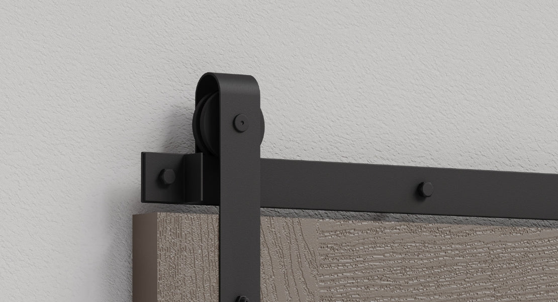
- Material influence: Remember that even when painted, the material of the barn door can add texture and depth, influencing how the color is perceived. A distressed finish will soften the color's impact, while a high-gloss finish will intensify it.
- Hardware impact. The color and finish of your barn door hardware (matte black, polished brass, chrome, antique bronze) will significantly affect the door's overall psychological impact.
- Room transitions. You can use your sliding barn door's color to signal a mood shift as you move from one room to another. A bright yellow door leading to a creative studio, or a calming blue door opening into a serene bedroom.
It’s also worth remembering that there are plenty of glass barn door options out there, which allow for seamless transitions between rooms, showing how the color psychology story of your home plays out from space to space. The natural light can also massively enhance blues and greens, creating a sense of biophilic appeal.
Embrace color psychology in your home
Color psychology is a powerful tool in interior design, allowing us to shape the atmosphere and emotional impact of our homes. From the soothing embrace of blues and greens to the invigorating energy of yellows and reds, every hue tells a story.
Your barn door, far from being a mere functional barrier, is a fantastic canvas for applying these principles. Whether you choose a bold color, a serene neutral, or a textured finish that connects to nature, your barn door can amplify the desired psychological effect of your space.
If you’re eager to learn more about interior design and barn doors, visit our blog today!